expo 67 lounge

Mid-century fashion, vintage pop culture and retro cool... from Expo 67 and beyond.

31 August 2006

Expo 67 By a Space:1999 Fan

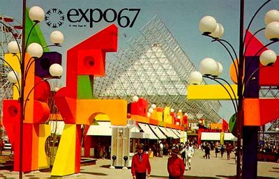
Of course, I love the original Expo 67 logo, but when I stumbled upon this one on the website of a Space:1999 fan, I flipped out... Turns out that a childhood visit to Expo 67 was the pivotal point in that fan's love of all things retro-futuristic...

Check out the page here, it has some great pictures of Expo...

Labels:

Star Trek Memories

While on vacation at my parent's cottage, I found this book on the coffee table, and I must say, I can hardly put it down.

Written by Captain Kirk himself, this book offers an insider's look at the 3-year run of the original Star Trek series, complete with cast interviews and photos.

Chock full of (almost useless) details and trivia, this is just the type of book I like to read...

And, it doesn't hurt that I totally love the original Star Trek series...

image: fiercefocus.com

Labels: ,

29 August 2006

Queen Elizabeth II at Expo 67

Her Royal Majesty visited Expo 67 on July 3, 1967. (And don't you just love the outfit she wore...)

The Queen arrived on the Brittania, the Royal Yacht (of course, how else would she have arrived?)

Her itinerary for the day included a Royal Salute by the Royal 22nd Regiment as well as visits to such pavilions as: Great Britain, the Western Provinces, Quebec, Ontario and the Atlantic Provinces.

Her Majesty's last stop was the Canadian Pavilion, with an official luncheon at The Toundra restaurant. (The Toundra hall still exists today and can be rented for receptions... Wedding, anyone?)

It was during this lunch that Queen Elizabeth told Prime Minister Lester B. Pearson that she would like to tour the site by minirail (a request that apparently caused Expo Security quite a moment of anxiety...).

Of course, Her Majesty got her way and rode the minirail for 40 minutes, to the cheer and admiration of Her Royal Subjects...

photos: library and archives Canada

Labels: ,

28 August 2006

Man in the Community / Man & His Health

Man in the Community

The roof of the Man in the Community pavilion was a made up of stacked wooden polygons decreasing in size to form a slender, elegant pyramid. The wood used for this spectacular trellis came from the forests of Canada's Pacific Coast.

The spaces between these wooden beams were left open so that, when it rained, the drops fell from the roof into a pond in the center of the pavilion. A garden that extended beyond the outer walls of the pavilion surrounded the pond.

The first section of the pavilion was comprised of 7 exhibition halls that depicted different aspects of city life:

The first exhibit, entitled Citerama, was a cacophony of urban images and sound. The second, The Lonely Community, showed the "cages" in which city dwellers are often trapped, seperated by sex, age, class, even illness. (The visitor was symbolically "caged" by the creative use of mirror.) The third exhibit, The Electronic Community, illustrated the dangers in the onslaught of information in the computer age. The Workday Community used puppets to illustrate man's inherent aversion to progress.

The second section of the pavilion concentrated on solutions rather than problems:

Community on the March and The Interdependant Community showed the challenges that faced underdevelopped and/or emerging nations.

Urbanissimo was a cartoon presented in the final section of the pavilion. It showed how the city seduced the farmer with it's charms, with the alienation of nature as a consequence...

Man and His Health

The Man and His Health pavilion was adjacent to Man in the Community.

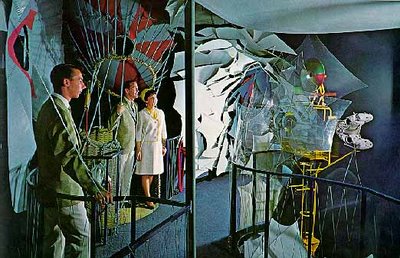
The core of the pavilion was Meditheatre which combined cinema and theatre to show achievements in modern medicine. Open heart surgery and caesarian birth were among the procedures presented.

There were 5 exhibit halls that surrounded Meditheatre. The world's major health problems, the adaptation of hospital services in the age of electronics and the freezing of human organs were among some of the topics discussed.

The Man in the Community and Man and his Health pavilions were, in my opinion, some of the most striking and beautiful at Expo 67.

The concept of using fallen rain water in the former remains as modern and innovative in 2006 as it was in 1967...


images: (1-5) naid.sppsr.ucla.edu/expo67/

(2-3) FOS Productions
"Meditheatre": alamedainfo.com

Labels:

24 August 2006

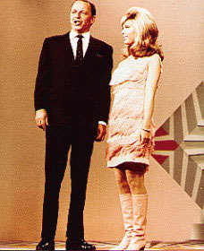
Nancy Sinatra

Nancy Sinatra is the daughter of legendary singer Frank Sinatra and his first wife Nancy Barbato.

Nancy made her television debut in 1960, on her father's television special, with co-star Elvis Presley. (Nancy was sent to the airport on her father's behalf to welcome Elvis back from his stint in the army...)

Nancy's recordings in the early 1960's went virtually unnoticed. It wasn't until 1965 that her life would change forever.

Record producer and collaborator Lee Hazlewood convinced Nancy to lower her singing voice. Her new sound was paired up with a drastic image overhaul: dyed-blonde hair, heavy eye makeup with frosty lips and a mod new wardrobe. It was then that Nancy released her first and biggest hit: These Boots Are Made For Walkin'.

Nancy pioneered the way for a whole new generation of tough-yet-sexy rock chicks. Up until that point, female love songs involved girls crying over their diaries for a boy who misbehaved. Nancy Sinatra turned the tables on men and let them know who was boss!

Pop-goddess Madonna was quoted to have said: "Nancy Sinatra was a huge influence on me. I wanted to put on my go-go boots and walk all over someone..."

The video for These Boots Are Made For Walkin' is a great example of 60's high camp. Needless to say, it's also one of my all-time favorites... Enjoy!


images: (top) allposters.com

(bottom) dustygroove.com

Labels: ,

23 August 2006

The Austrian Pavilion

Austria's pavilion at Expo 67 was composed of white aluminum triangles, arranged in a "honeycomb" pattern, suggesting the molecular structure of crystal. A 120-foot mast featured an illuminated 3-D "flag", proudly diplaying Austria's national colors.

The crystalline form of the pavilion was meant to emphasize Austria's precision in science and engineering, while symbolizing the richness of it's natural and cultural heritage.

The ground floor of the pavilion divided itself into sections that borrowed Expo's sub-themes:

Man in the Community displayed replicas of the Austrian Civil Code, as well as treaty documents, coins, medals, stamps and decorations.

Man the Explorer dealt with Austrian innovations in such fields as the detection of nuclear substances and the transportation of radioactive materials.

Man the Creator emphasized renowned Austrian composers, writers and scientists such as Johann Strauss and Sigmund Freud.

Man the Producer was sub-divided into 4 sections which dealt with industrial achievements in electricity, machinery, transportation and steel production.

Additional display cases exhibited exquisite glassware and ceramics, as well as examples of traditional folk art.

The second floor, reached by escalator, featured Austrovision, an ultra-modern, audio-visual experience that described Austrian life, past and present.

Waitresses dressed in authentic costume served Viennese specialities in the adjoining Wienerwald restaurant.

photos: expo 67.ncf.ca

Labels:

18 August 2006

A Place to Stand

A Place to Stand was an 18-minute film presented at the Ontario pavilion at Expo 67.

Produced and directed by Christopher Chapman, this film used the ground-breaking multi dynamic image technique, showing life in Ontario without the use of narration or titles. Up to 15 simultaneous images were shown on one screen, using an hour and a half of footage for an 18-minute movie.

The video I have here is only a small excerpt, and I must admit that it was probably a little more impressive in it's original 66-by-30-foot format...

An important element of the film was it's soundtrack. Composed by Dolores Claman, with lyrics by Richard Morris, A Place to Stand's theme song etched itself in the collective consciousness of a generation. I know whenever I hear it, I have it in my head for days:

"Give us a place to stand
And a place to grow
And call this land Ontario!
A place to live
For you and me
With hopes as high
As the tallest tree
Give us a land of lakes
And a land of snow
And we will build Ontario!
A place to stand, a place to grow
Ontari-ari-ari-o!"


image: expo67.ncf.ca

video: archives of Ontario

Labels: ,

17 August 2006

La Ronde

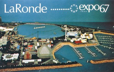
La Ronde was one of the most popular sections of Expo 67, attracting 22.5 million visitors in 1967. Though Expo 67 was designed to be dismantled at the end of it's 6-month run, La Ronde had been intended as a permanent Montreal attraction that would last beyond Expo. Indeed, La Ronde has been thrilling visitors for almost 40 years now...
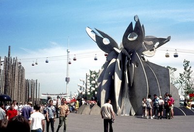
Popular sections of the park included Fort Edmonton, an "old West" town sponsored by the city of Edmonton. Visitors could have their hair cut, have their picture taken behind bars, or relax and have a drink at the Golden Garter Saloon. It was in this section that the popular log flume ride, La Pitoune, was found. The aquatic roller coaster still exists today, one of the most popular of La Ronde. An estimated 20 million people have been on it since 1967!
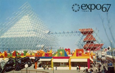
La Ronde had an impressive collection of the latest in amusement park rides, the star attraction being the Gyrotron. The Gyrotron was a huge pyramid of metal scaffolding, reminding me of the exterior of the U.S. or the Netherlands pavilions. The ride promised to be a thrilling adventure first through space and then down to the core of the earth. Unfortunately, the ride had to be slowed down due to safety concerns, and was a little less thrilling than promised...
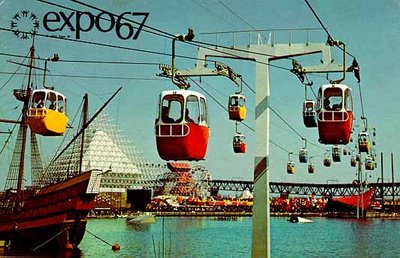
La Ronde's cable car system, called the Sky Ride, offered visitors a convenient means of crossing the park. A cable car station was intentionally located near the entrance of La Ronde, to help disperse the thick crowds. The ride has been dismantled in recent years, but I remember riding on it as a kid when visiting La Ronde. It was one of my favorite rides, offering a magnificent view of the park.
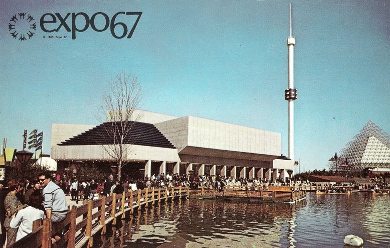
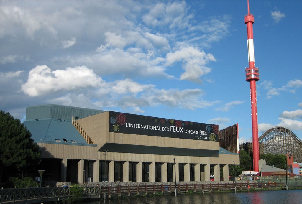

The Garden of Stars was a 1500 seat theatre that held teen-age activities during the day, and Las Vegas-like revues at night. The building still exists today and even the interior (complete with cheesy brown and orange carpeting) has been mostly unchanged since Expo 67...
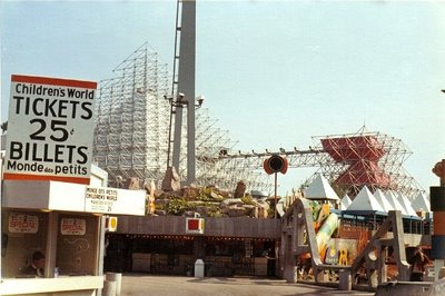
A Children's World section, devoted to kids aged 4 to 9 years, offered rides inspired by the "Tales of Mother Goose". Three of the original rides are still in operation: a miniature roller coaster, a water journey in a tub, and an old-time train ride.

The La Ronde theme park is the only part of Expo 67 in existance today that still serves it's original purpose. I go every summer, and imagine myself visiting Expo 67...

To see photos of my trip to La Ronde on August 15, 2006, click here.
images: from top: (1) author's own, (2) FOS productions,
(3) alamedainfo.com (4) naid.sppsr.ucla
(5) alamedainfo.com (6) author's own
(7) FOS productions (8) alamedainfo.com

Labels: ,

12 August 2006

The 1959 Cadillac

I just got a car, and although I love it, a 2003 Mazda Protegé 5 is not exactly the stuff of retro blog posts...
The 1959 Cadillac, however, is about as retro as you can get! Perhaps the most famous car design in automotive history, the 1959 Cadillacs hold an important place in modern popular culture. They are about as apple pie as Marilyn Monroe or Elvis Presley.

In the 1950's, Cadillac was the undisputed leader in automobile design. During that decade, the North American economy was bouncing back from the Great Depression and World War II. Optimism reigned as America entered the Space Age, and suddenly luxury and splendor were back in vogue. No longer just for transportation, cars and their designs displayed a growing attention to style.

These lavish designs reached their peak with the 1959 Cadillac. The most famous feature of this car was the extravagant 12-inch fins with rocket tail lights. Cadillac ads at the time featured these prominently...
As a kid, I was always fascinated by these beautiful cars, and I've always dreamt of owning one someday...

images: (top) plan59.com
(bottom) 1959cadillac.com

Labels:

The Cuban Pavilion

Cuba's pavilion at Expo 67 had a modern, cubist look, evocative of a Mondrian painting. The look of the 3-storey pavilion was a result of it's economical assembly: white boxes were pre-fabricated in Cuba and installed on the Expo site.

Like the Indians of Canada pavilion, Cuba's presentation was controversial. Under the theme Revolution, the pro-Castro exhibit was frankly propagandistic. The designers of the pavilion relied on strong photographic images which spilled onto the floors and ceilings for maximum impact. These huge black and white images depicted violence, oppression and revolution.

There were not many captions to these photos, so visitors had to rely on explanatons from the pavilion's hostesses, who referred to Castro as "Fidel", as if he were an adored older brother.

Fishbowl windows in colors of red, blue and yellow distorted the view of the outside world, heightening the intense atmosphere of the exhibit. On the top floor, a wordless film comprised of newsreel footage was presented. The screens which formed the walls of this section were transparent so that at night, passers-by could look up and see the flickering images projected.

Cuban delicacies and rum were served in the pavilion's bar and restaurant.

photos: naid.sppsr.ucla.edu/expo67/

Labels:

6 August 2006

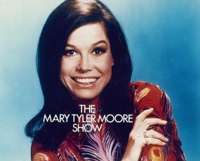
Mary Tyler Moore

Speaking of women's liberation...

The Mary Tyler Moore show debuted in September 1970, and ran for 7 years. Audiences immediately fell under the spell of the beautiful Mary Richards, a sweet yet vulnerable young woman who moved to Minneapolis after a failed relationship. Although not the first show to feature a young, single female lead, it is the most highly acclaimed and beloved of that genre.

Mary Tyler Moore's character, Mary Richards, was initially supposed to be a divorcée. Producers were worried that audiences would think she divorced Rob Petrie, her onscreen husband during the Dick Van Dyke Show, which had ended only 4 years prior. It was then decided that her character had moved to Minneapolis after a broken engagement.


Screen captures from the first season, where Mary wore a wig.

Producers were also concerned about visual differentiation of those two characters. Seeing as Mary Tyler Moore's hairstyle had remained essentially the same since The Dick Van Dyke Show, she wore a long flip wig during the first season of The Mary Tyler Moore Show.

That wig must have been hell-on-earth for Mary under those hot studio lights, but I love the way it looked! I prefer it to her natural hair...!

One of the best moments of The Mary Tyler Moore Show (and one of the greatest moments in television history, for that matter) was the opening theme, where Mary tosses her hat as a sign of independance.

In 2002, the cable network TV Land had a statue made to commemorate that moment. It stands in downtown Minneapolis, in front of Macy's department store.

Included below is the opening sequence... Enjoy!

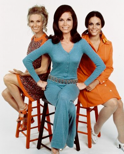
With sidekicks Phyllis (Cloris Leachman, left) and Rhoda (Valerie Harper, right).


images: (1) allaboutjazz.com

(2-3-5) flickr.com
(4) wikipedia.org

Labels: ,

4 August 2006

Woman and Her World

Expo 67 was a very modern event. Some of the concepts presented at Expo are as valid today as they were in 1967. But once in a while, I'll come across a document that (painfully) reminds me that Expo 67 took place almost 40 years ago (and, might I add, before women's liberation...)

Such is the case for a pamphlet I found a few years ago at an antique dealer. I suspect it was given out at the Hospitality pavilion, a pavilion sponsored by 4 Canadian natural gas companies, dedicated to women. The pamphlet proudly states Woman and Her World at Expo 67, in pink and purple with a floral motif...

The first paragraph of the pamphlet states "if you are a man, read no further!" It goes on to say that although Expo's general theme is Man and His World, it's a woman's world, too! But what this document deems as important to a "woman's world" is amusingly archaic by today's standards...

What are some of the exciting activities mentioned for women? Fashion shows. Pageants. Historical doll exhibits. Handicraft displays. And the special services offered specifically to women? Babysitting...

The best part of this pamphlet is the section on What to Wear to Expo 67. It suggests wearing "a basic print dress that will stay wrinkle-free and can be accesorized for evening wear" because pants "would mean changing every time your husband took you out to the many evening attractions"...(!)

The pamphlet strongly suggests picking up Singer's Sew-it-Yourself Wardrobe for Expo, yet another useful pamphlet that gave detailed costs, fabric suggestions and important tips on sewing your own clothes for Expo!

So that every woman could be beautiful and elegant at Expo 67...

images: personal collection

Labels: , , ,

3 August 2006

Impressions of Expo 67

This movie was produced in 1967 by the National Film Board of Canada.


In my opinion, it is one of the best video documents of Expo. It is only 8 minutes long, but it really captures the mood of this great event...

Labels:

1 August 2006

Air Canada Pavilion

The architecture of Air Canada's participation at Expo 67 was intended to evoke the spirit of flight.

The focal point of the pavilion's exterior was a helical roof with 23 blades that fanned out from a 60-foot central column.

The design was meant to represent the turbine of a modern jet engine, yet it has always reminded me of a Leonardo Da Vinci sketch...


Beneath the roof, 3 cylindrical buildings contained the exhibition areas:

The Dream dealt with the man's subconscious desire to fly throughout history.

The Achievement spoke of man's conquest of the sky from early balloons and gliders to modern jet planes.

New Worlds illustrated the impact of aviation on Man and His World.


images: (top) alamedainfo.com
(bottom) naid.sppsr.ucla.edu/expo67/

Labels:

Home

← Older Posts

Newer Posts →