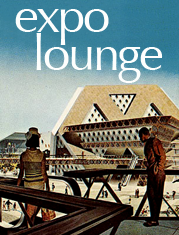
The Expo 67 Logo
 I have always had an interest in logos and corporate identities. I remember helping my dad create a logo for his company when I was in grade school.
Designed by Montreal industrial artist Julien Hébert, the Expo 67 logo is a timeless design with it's avant-garde lower-case font (Optima) and it's circle of stick-figure men, arms outstretched in fellowship. Instantly recognizable, infinitely elegant, the graphic symbol of the 1967 World Exhibition is as close to perfection as a logo could be...
But, as you know by now, I have a biased opinion when it comes to Expo 67!
image: wikipedia.org
Labels: expo life, groovy graphic art
posted by Jason Stockl @ 7:54 pm
![]()
2 Comments:
Do you think that Columbia, Maryland plagiarized the expo67 logo for their logo?
http://en.wikipedia.org/wiki/Columbia,_Maryland
You mean the statue with outstretched arms? It's reminiscent, but I wouldn't quite call it plagiarism.
Post a Comment