1976 Olympics Posters
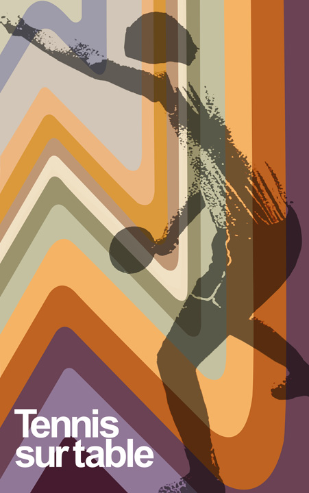 Montreal hosted the 1976 Olympics from July 17 to August 1 of that year.
A series of posters was created for the '76 Summer Games and to promote physical fitness in general. My good friend DC Hillier came across the images in a flickr set: the posters are apparently still up somewhere at the Olympic Stadium.
DC painstakingly recreated the fab images you see here...
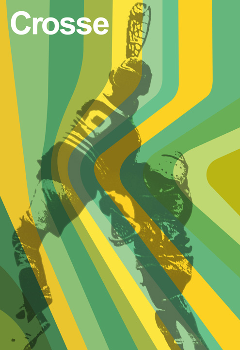
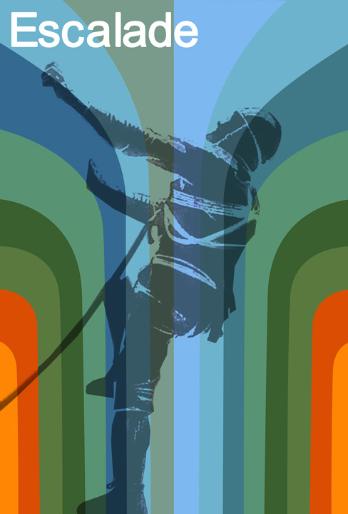

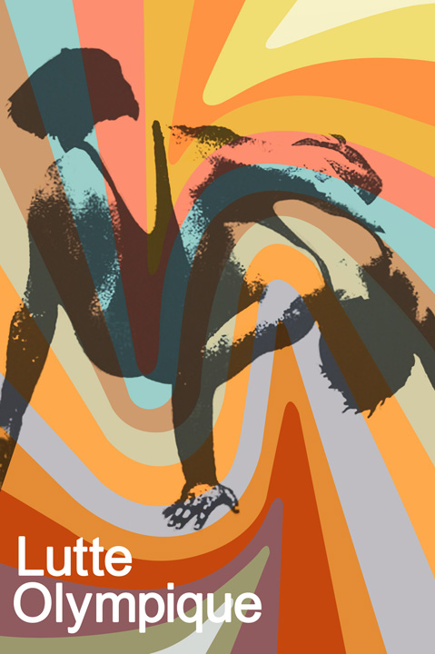

 images: courtesy of DC Hillier
Labels: groovy graphic art
6 Comments:
Those would be perfect...if they didn't use Arial. (Arial ≠ Helvetica). Especially considering that Arial was commissioned by Microsoft for Windows, which puts it chronologically much later than the Olympics.
In fact, many of the 1976 Olympic graphics were re-uses of the system created by designer Otl Aicher for the 1972 Munich games.
You are right, aj, originally they did use Helvetiva for this series - however, these we recreated as part of a demonstration for a presentation I'm doing and I used Arial out of simplicity. Agreed, Arial is not Helvetica but honesty - they both suck ;)
Seem to be put out by Quebec Gov't (upper corner) not by Olympic Committee. Don't remember golf or lacrosse being official sports!
My uncle had a wonderfully tacky 1976 Olympics promotional poster with serene-looking Greek goddesses. I always found the official logo kind of ugly. Here's an article on its design: http://wemadethis.typepad.com/we_made_this/montreal-olympics-1976.html
hi there!
just discovered this blog through google, and wanted to mention that i took the photos referenced in the flickr link above - amazed they've made it beyond my friends!
i visited montreal in dec. '07 and took the olympic stadium tour - that's how i came across these. they're actually in the sports centre, on a wall of a hallway that's to the left (right by the gift shop - it goes behind the pool area on the scoreboard side) when you enter the building - i think you could get back there without taking the tour. :)
anyway...just thrilled to see there's others who appreciate their sweetness! (although i must respectfully disagree on helvetica sucking. heh.)
I have several of the original posters as my Dad was one of the designers on the project. I'll go have a look at which ones we have and maybe put up some shots of them.
Post a Comment