expo 67 lounge

Mid-century fashion, vintage pop culture and retro cool... from Expo 67 and beyond.

29 May 2006

Piknic Électronik

.
One of the most famous sculptures at Expo 67, Alexandre Calder's "Man" still stands today, on Île Saint-Hélene. It was sponsored for Expo, in 1967, by the International Nickel Company of Canada. It stands exactly 67 feet tall (coincidence?...)

The sculpture was moved from it's original spot, during the relandscaping of the old Expo site, in 1992. It now occupies a platform visible from the old port of Montreal. The sculpture is even illuminated at night, the way it would have been during Expo.

For the last 2 years, a group of local Montreal DJ's have been organizing the "Piknic Électronik" on weather-permitting Sundays during the summer. The event is centered around the famous sculpture that has become it's symbol. For those familiar with the Montreal Tam-Tam's, it's the same concept but with DJ's spinning electronic music. The crowd is surprisingly diverse, and the event has become very popular.

I love Piknic Électronik! It brings life back to the old Expo islands. The music's great, and it's fun to dance in the sunshine under an Expo relic!

To visit their website, click here.
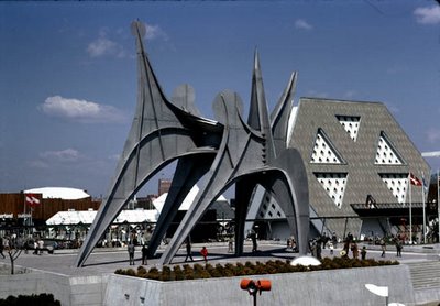
1967 photo: naid.sppsr.ucla.edu/expo67

Labels: ,

27 May 2006

Quebec Connection

I am not alone, it seems.

Quebec Connection is a local Montreal musical group comprised of Nathaniel Hebert and occasional-collaborator Synergy Plus. Like me, Nathaniel's fascination for Expo began early on, upon seeing the ruins of the Expo 67 site, as a kid.

Nathaniel visited Man and His World (the yearly exhibition that followed up Expo) in the early 1980's. Though I never got to see Man and His World (it finally closed when I was very young), I do remember passing by the impressive Habitat 67 apartment project, and the abandoned American Pavilion dome, and asking my dad what they were.

Quebec Connection released an album entitled "Bonjour Expo" in the fall of 2004. The cover is designed like an Expo passport, and the song list includes some great titles ("Man the Explorer", "Man in Control?"). The sound is retro electro, like an obscure CBC documentary from the 70's...
Their website is great: quebecconnection.ca

images: quebecconnection.ca

Labels:

26 May 2006

TV Dinners

One of my favorite things to eat for lunch, as a kid, was a TV Dinner.

When I was little, my mom bought me the TV Dinners that just had meat and potatoes (kid size) and the regular ones for herself (adult size). I would have turkey, occasionally, but my favorite was fried chicken (my love of fried chicken began at an early age).

We even had the metal TV Dinner trays (what else would you eat a TV Dinner off of...?)

TV Dinners were invented over 50 years ago by two brothers named Gilbert and Clark Swanson. Inspired by space saving trays used for airline food, these pre-packaged dinners tied themselves in to the novelty that was sweeping over America in the 1950's: the television.

Betty Fussel, food historian and author of "Kitchen Wars" writes: "The childlike packaging makes it appealing. The food is segmented, just the way we seperate food on our plates when we're children and don't want things mixed. It's a form of comfort to us. Everything is in it's place." (source: "At 50, TV Dinner is still cooking" by Mary Dixon Lebeau)

I couldn't have summed it up better myself.

Unfortunately, as with many things, I find TV Dinners have gone down in quality over the years. The replacement of the aluminum trays with plastic ones in the mid 1980's was, for me, the beginning of the end...


images: flickr.com

Labels:

22 May 2006

Minirail '67

When I imagine myself visiting Expo 67 (and you know I do), I always imagine myself riding around on the Minirail.

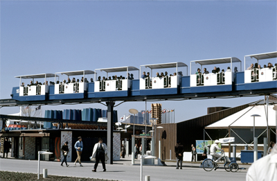
The "Minirail" was a system of small trains that circled Expo on an elevated track. There were 2 types of trains: the blue line Monorail, with larger cars and a more extensive route, and the yellow line Minirail.

Not intended to be a fast and efficient mode of transport, the Minirail offered a slow, panoramic view of Expo. It rode over water, under waterfalls, even through the U.S. geodesic dome!

La Ronde, the amusement park from Expo 67, is still in operation today, as is it's yellow line Minirail. I go to La Ronde every year, and it's become my ritual to first tour the entire park by Minirail before going on any other rides.

On uncrowded days, I stay on the Minirail for 2 to 3 turns. I always sit near the end of the train, facing forward, to get a good view of the train itself, as well as the site... I sit back and imagine myself at Expo 67...

To see the La Ronde Minirail today click here.


images: (1 and 3) library and archives Canada
(2) Bill Dutfield

Labels: ,

21 May 2006

The Ladies of Star Trek

I love Star Trek, the original series. The son of a die-hard trekkie, I watched Sunday morning reruns on CBC, all throughout my childhood, with my mom.

Star Trek came about in the mid 1960's, when there was great interest in space travel and exploration. It was a time where people thought we would one day live on the moon. The most popular national pavilions at Expo 67 were ones that boasted space exhibits.

The shows were very well written, as their enduring appeal will attest.

The best part of Star Trek, for me, is the retro-futuristic aesthetic. The Starfleet Command uniform for ladies included a miniskirt and knee high boots! (nothing could be more practical, or comfortable, in outer space...!) Captain Kirk was always falling in love with some scantily-clad alien woman with sky-high hair! And the close-up shots of all these beautiful women were always in soft focus...

Yeoman Janice Rand deserves an honorable mention, here. As a kid, I was always intrigued by her blonde, basket-weave beehive!

Lieutenant Uhura, played by Nichelle Nichols, was one of my favorites. In the 60's, a beautiful black woman playing an important role in a television series was ahead of its time. The name Uhura means "freedom" in Swahili.

By the end Star Trek's first season, Nichelle Nichols wanted to leave the show. A chance meeting with Martin Luther King, himself, changed her mind. He told her not to give up, that she was a great role model for young black women everywhere.

images: (top) io9.com
(bottom) trekcore.com

Labels: , ,

The Artist's Conception

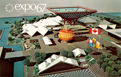
Expo 67 was to be an example of the future, where people would live in geodesic domes, riding monorails... Perhaps no images conjure up this feeling as well as artists' conceptions of Expo 67, before it opened.

At the beginning of Expo, postcards and souvenirs featured scale models, drawings and paintings of the site, seeing as no photographs could be taken during the preperation of this ephemera.

The resulting images were elegant on occasion (above), but more often bizarre and incomprehensible (below).


images: (1-2) library and archives Canada
(3) alamedainfo.com

Labels: ,

20 May 2006

The German Pavilion

The most notable element of the Federal Republic of Germany pavilion at Expo 67 was it's architecture.

The German pavilion was designed by Frei Otto, using a revolutionary concept in exhibition structures: the "space frame" tent. 8 giant masts, the tallest of which measured 120 feet, supported a translucent plastic covering. The advantage of this system of architecture was in it's flexibility and adaptability to various site restrictions.

Inside, the pavilion's focus was mainly on product and industrial displays, including optical and precision instruments, a German strong point. Scientific and historical displays included the world's first printing press, a German invention. The press was 500 years old, and still working on site. In Art, the pavilion focussed on the history of music.

As in most pavilions, there were restaurants which served national specialties, as well as a German beer garden.

images: (1) alamedainfo.com
(2-3-5) library and archives Canada

(4) westland.net/expo67/

Labels:

17 May 2006

Twiggy

Twiggy (née Lesley Hornby) was a young British girl who became a worldwide sensation in the late 1960's.

With an impossibly thin figure, boyish cut hair and huge, striking eyes, she represented the free-spirited, youthful look that was very in vogue at that time.

Twiggy is considered the world's first supermodel, and the first person to be immortalized as her own Barbie doll by Mattel, in 1967.

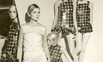
What is less known is that Mattel wasn't the first company to immortalize Twiggy as a "doll". There was also a Twiggy mannequin.

Adel Rootstein was founder of her own mannequin company in the late 1950's. What set Rootstein mannequins apart was that their figures were sculpted by artists, based on real people. This ensured that the mannequins would appear as realistic as possible.

To this day, the Rootstein company uses real people to create their mannequins, which are considered the best in the world.

Adel Rootstein discovered Twiggy right before she became a household name. By the time Twiggy, herself, first visited New York in 1967, her mannequins were already in the windows of the finest shops in the city!

images: (top) linda-project.com
(middle) source unknown
(bottom): rootstein.com

Labels: ,

15 May 2006

Crystal Addict

I grew up loving my grandmother and her fabulous front-hall chandelier. When I was a teenager I finally inherited that said chandelier (with a little grandson sweet-talking, of course...).

Once I had my grandmother convinced, I had to convince my mother that, first of all, it was entirely appropriate for my bedroom, and second, that I would clean it.

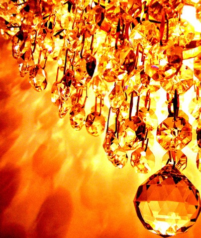
Chandeliers have always appealed to my it's-impractical-but-beautiful side, like high heeled shoes or tiaras. There was a period in the 1960's where no home was truly fashionable without a crystal chandelier in the front hallway. Nothing better to highlight the shag carpet and gold wallpaper!

I have since inherited two other chandeliers from my aunt when she redecorated. My three chandeliers have been following me in every apartment I've had. They are my treasures of which I will never part...

images: (top) foodnetwork.com
(bottom) flickr.com

Labels:

13 May 2006

The "Katimavik"

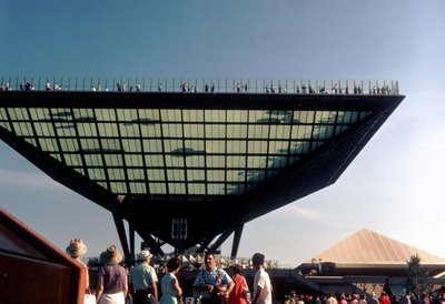
The dominant element of the Canadian pavilion, and one of Expo 67's architectual symbols, was the inverted pyramid known as the Katimavik. The origin of this design element is amusing, especially given that we here in Quebec are (finally!) on the eve of a provincial law prohibiting smoking in any public place.

In Yves Jasmin's fabulous book, "La petite histoire d'expo 67", Mr. Jasmin describes the design process of the pavilion which was to symbolize the modern Canada of 1967.

He describes the building of a scale model of this pavilion. The architects working on it were getting ready to go to lunch, when they decided to rest a heavy, inverted-pyramid shaped ashtray on their maquette to hold two glued pieces together during their break.

Upon return from their lunch, they were struck by how elegant this pyramid was, and decided to integrate it into the pavilion's design.

Canada was represented at Expo 67 by, basically... a giant ashtray.

photo: (top) alamedainfo.com
(bottom) www.space1999.net

Labels:

Lather, Rinse, Repeat

Long before my career in window dressing, I went to hairdressing school. (I know, I know... hairdresser, window dresser... next career: florist!)

I went to hairdressing school about ten years ago. I have to say my parents sent me to the best (and surely most expensive) school in Montreal.

I absolutely loved hairdressing school. What struck me was how archaic our curriculum was. Our course subjects included "hair setting" and "pin curling", while "creme rinse" and "cold wave" were among the technical terms used!

We had customers who actually paid money to have their hair ruined... er, styled, by us students.

I must have convinced every customer I had to let me set their hair on rollers. Roller setting was the way of styling hair in the 50's and 60's... Jackie Kennedy's fabulous bouffant hairdos were achieved this way.

To roller set, wet hair is sprayed with setting lotion and wound on rollers held with clips. The customer is then tortured under a hot hair dryer for an hour or more, sometimes, depending on hair length and thickness.

Once the hair is completely dry, it's brushed out to loosen the crunchy curls, and then teased to high heaven! I love teasing hair, and I had great satisfaction in styling my victims, er... customers.

No matter what my clients asked for, when they got up from my chair, they resembled Annette Funicello, circa 1964!


photos: www.hairarchives.com

Labels: , ,

8 May 2006

The Expo 67 Logo

I have always had an interest in logos and corporate identities. I remember helping my dad create a logo for his company when I was in grade school.

Designed by Montreal industrial artist Julien Hébert, the Expo 67 logo is a timeless design with it's avant-garde lower-case font (Optima) and it's circle of stick-figure men, arms outstretched in fellowship. Instantly recognizable, infinitely elegant, the graphic symbol of the 1967 World Exhibition is as close to perfection as a logo could be...

But, as you know by now, I have a biased opinion when it comes to Expo 67!

image: wikipedia.org

Labels: ,

7 May 2006

The Kaleidoscope Pavilion

Though the bulk of pavilions at Expo 67 were national, there were some noteworthy theme and private pavilions.

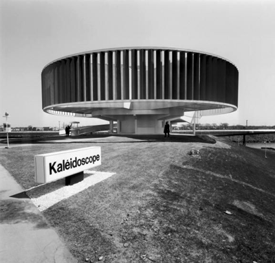
Located on the south side of Île-Notre-Dame, the Kaleidoscope pavilion was presented by 6 of Canada's leading chemical producers: Canadian Industries Limited, Chemcell Limited, Cyanamid of Canada Limited, Shawinigan Chemicals Limited and Union Carbide Canada Limited.

Kaleidoscope's hostesses were all former Miss Canada contestants.

The Kaleidoscope pavilion's exterior was itself an optical illusion: 112 vertical fins painted different hues surrounded a circular steel frame. Depending on the visitor's point of view, the colors appeared to change and the giant steel ring seemed to move... Far out!

Kaleidoscope at night.

Kaleidoscope's presentation, entitled "Man and Color", was seperated into 3 parts, viewed in 3 seperate chambers. "Nature and Play", "Technology and Electronics" and "Planetary Sphere" featured a story line, covering the colors of morning, midday, and evening.

Huge mirrors were used to reflect images and hues like an actual kaleidoscope. This resulted in striking optical illusions that played on the emotions of the visitor. A dramatic soundtrack enhanced the experience.

The Toronto Star enthusiastically hailed the Kaleidoscope pavilion as "the most beautiful esthetic experience at Expo"...

112 colorful fins seemed to change hues, depending on the point of view.


images: (1) naid.ucla.edu/expo67
(2) library and archives canada
(3) www.westland.net/expo67/
(4) www.jamd.com
(5) flickr.com/photos/jasonyoder/

Labels:

6 May 2006

The Predicta Television

I stumbled upon this brand while reading a design magazine.

Predicta is a line of nostalgic replicas of 1950's television sets, all fitted with the latest in modern technology.

I have always loved hi-fi and television designs of the 1950's. These units were expensive status symbols, and they were designed accordingly.

The website is really cool:
http://www.predicta.com

Labels:

Coconut Love


When I love something, I become obsessed.

I once read somewhere that the sense of smell can trigger very powerful memories. To this day, the smell of coconut/suntan lotion brings me back to childhood trips to the beach with my parents. It also represents, for me, a 60's and 70's beauty ideal: the deep, dark suntan.

My coconut passion has since developped into a way of life. I like nothing better than lying out in the sun during summer months, slathered in coconut-scented suntan lotion.

I am constantly on the lookout coconut foods and products in stores, restaurants, supermarkets...

I never tire of the sensual, tropical smell and taste of coconut!

images: (1) unknown source
(2 and 3) flipflopsmiley.blogspot.com

Labels:

5 May 2006

Michèle Richard

My love for Michèle Richard may take more than one post to explain...

Michèle Richard is a french-canadian singer, born in Sherbrooke, Quebec in 1946. Michèle's singing career began when she was 10 years old, after appearing on her father's local TV show.

The peak of her popularity was in the 1960's, where Michèle, in her late teens and early twenties, brought miniskirts and go go boots to french Canada. Michèle's success lay in her ability to deliver the mod sound of the swinging sixties to her teen Quebecois audience.

Her hits included french covers of such artists as the Beatles, Sonny and Cher and the Supremes, to name a few. These songs were pure 60's pop, dealing with boyfriends, break-ups, and having fun.

She could be seen every week performing these hits on the teen variety show, "Jeunesse d'aujourd'hui" (inspired by the "American Bandstand" concept).

Her overwhelming popularity at that time lead her to win the coveted award of Miss radio/télévision at the Gala des artistes in 1967.

Michèle was asked to record the official Expo 67 theme song, composed by Stephane Venne with english lyrics by Marcel Stellman. The 45 record included the original french version "Un jour un jour" on side A as well as it's english counterpart, "Hey Friend Say Friend" on the B side.

I first discovered Michèle Richard a few years ago, after I met my boyfriend. He introduced me to Québecois pop culture, which, growing up anglophone, I was not very familiar with.

I first fell in love with her song "Les boîtes à go go", a french version of Dave Clark Five's "At the Scene". The beat is infectious, the lyrics a plea to go out and have fun... I was curious to find out more about this cool mod girl! And, like Expo 67 itself, the more I found out, the more I fell in love.

My passion for Michèle Richard is carried over from my passion for Expo 67; the two belong together in my mind. Michèle seduced me with with her smile, the way she tilted her head. My favorite picture of her (just above) is the perfect example. Her girl next door quality exuded the optimism and joie de vivre of Quebec in the late 1960's, the way Expo 67 did.

photos: Michèle Richard "Les années 60" CD cover art

Labels: ,

1 May 2006

Vintage Pattern Illustrations

I really love vintage sewing pattern illustrations.

Part cartoon, part fashion illustration, home sewing patterns from the 1950's and 60's had some really great artwork.

What I love about these drawings is how well they depict the fashion ideal of an era, but with a bit of a housewife twist.

I just love the bouffant hairstyles and the domestic diva/drama queen poses!


These illustrations served the same purpose as mannequins in store windows: to seduce the customer into buying an image. Being a window dresser for the last five years, I have a deep appreciation and understanding of the power of these images.

Whenever I'm at a bazaar or garage sale, I hunt out these treasures. They usualy sell for pennies...

image: www.lanetzliving.net

Labels: ,

Home

← Older Posts

Newer Posts →